
KIA Logo Confusion


Campaign Idea
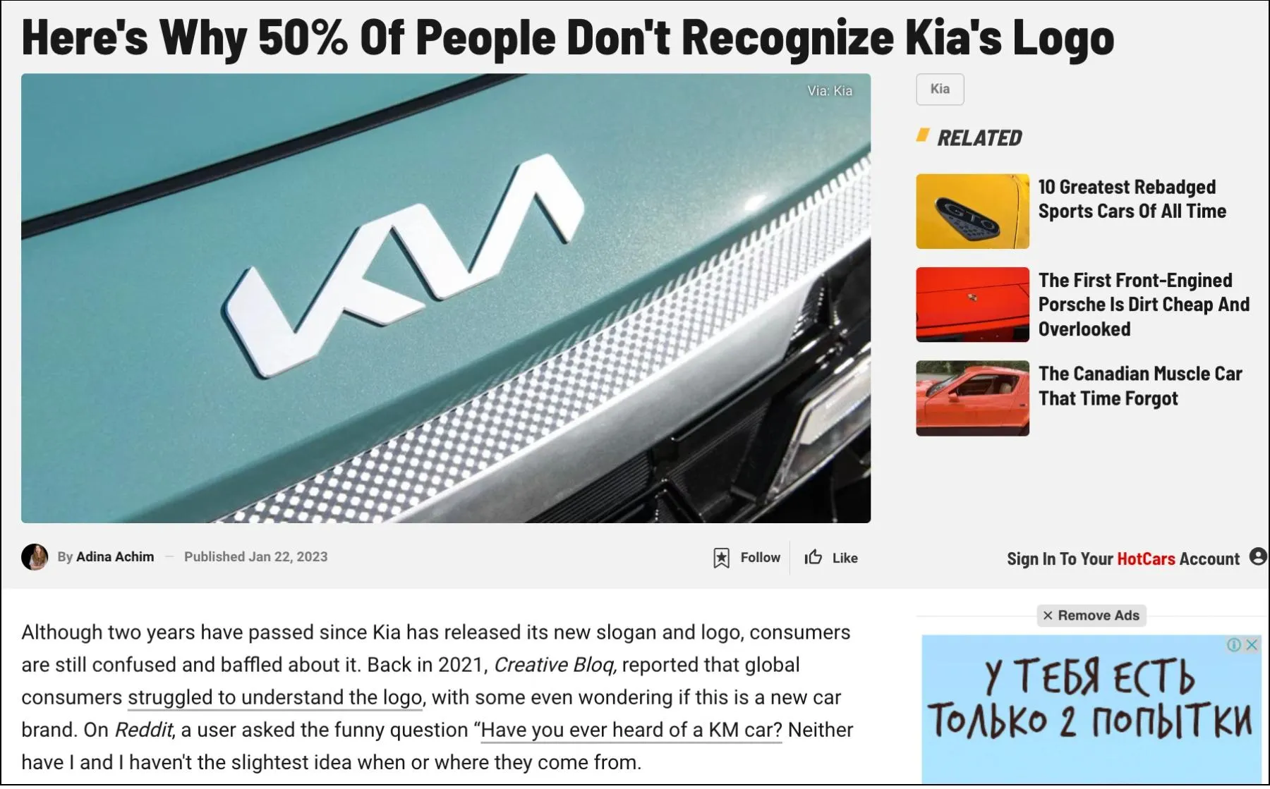
While KIA’s new minimalist logo aimed for a modern rebrand, there was a major gap in public recognition. We identified this as a unique opportunity to quantify the confusion surrounding the KIA logo. Through our media audit, we found that while KIA’s rebranding had been covered widely, there was no data-driven analysis on whether the redesign was effective and comprehensive.
We audited the media to see if the logo change theme is trending.
We identified a unique opportunity to quantify the confusion surrounding the KIA logo.
By highlighting real-world confusion using survey results, we created a compelling story that resonated with both automotive and business media.
Campaign Research
We surveyed 1,062 participants and presented them with an image of KIA’s new logo, asking them what letters they saw. The results were striking:
44% misidentified the logo, showing that nearly half of respondents struggled to recognize the brand name.
The most common misinterpretation was “KN”, with 26% of respondents selecting this answer.
Google search data reinforced the confusion, with 30,000+ monthly searches for “KN car”, proving this was a widespread issue.
Results
The campaign successfully turned a brand design flaw into a newsworthy story, securing 11+ backlinks, including Hot Cars and Media Post.
Earn Impossible Backlinks Through Digital PR


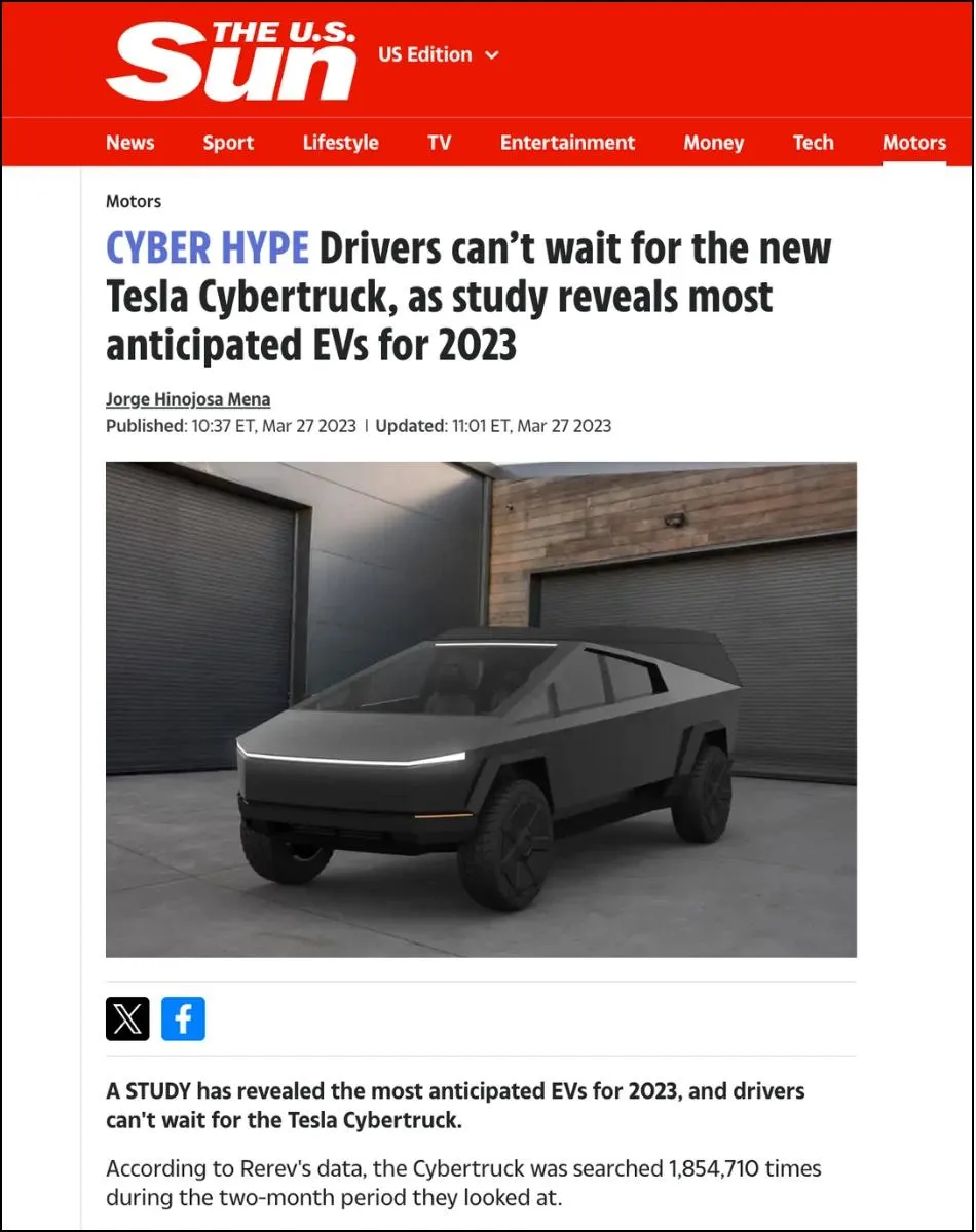
The Most Anticipated Electric Vehicles of 2023: According to User Searches
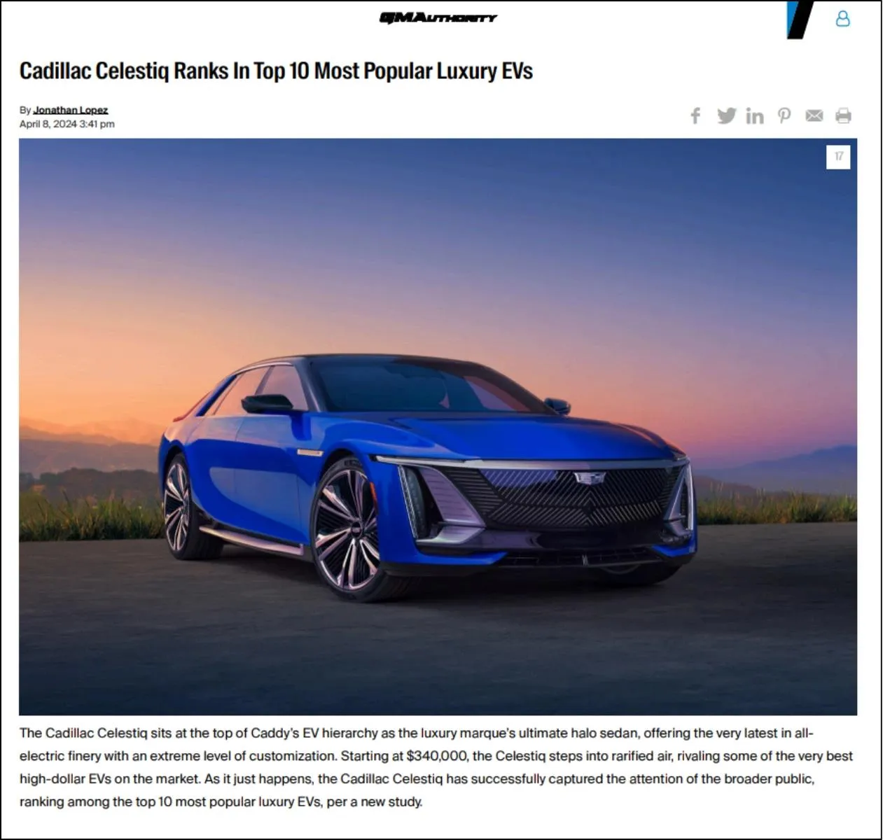
The Most Luxurious EV Cars
Top 10 Most Searched Halloween Outfits 2023